Edexcel A Level Economics A:复习笔记2.6.1 Possible Macroeconomic Objectives

Economic Growth
- Economic growth is a central macroeconomic aim of most governments
- Many developed nations (UK included) have an annual target rate of 2-3%
- This is considered to be sustainable growth
- Growth at this rate is less likely to cause excessive demand pull inflation
- Politicians often use it as a metric of the effectiveness of their policies and leadership
- Economic growth has positive impacts on confidence, consumption, investment, employment, incomes, living standards and government budgets
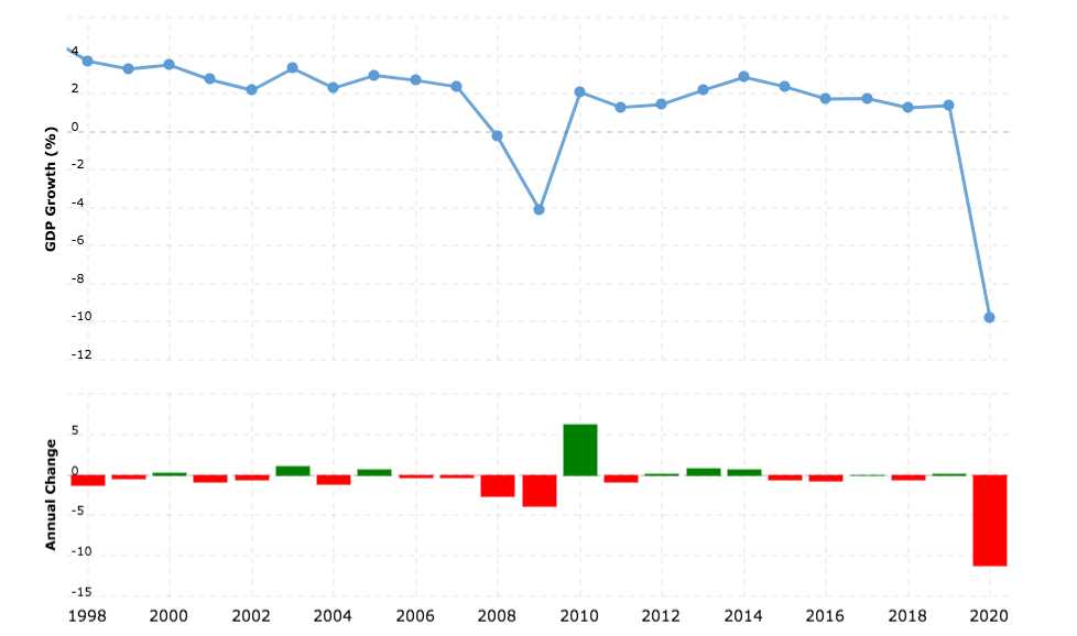
A diagram showing the economic growth rate of the UK since 1998
Source: Macrotrends
A Table Highlighting Some of the Economic Growth Trends in the UK Since 1998
| 1998-2007 | 2008-2015 | 2016-2019 | 2020 - |
|
Steady growth fluctuating between 2-4% |
Global financial crisis followed by rapid bounce back due to government intervention - and then steady growth | Gradual disinflation possibly due to future expectations regarding the impact of the Brexit vote | Supply chain issues due to Brexit. Decreased consumption due to the impact of Covid 19. These created a deep recession (short-lived due to government intervention) |
Low Unemployment
- The target unemployment rate for the UK is 4-5%
- This is close to the full employment level of labour (YFE)
- There will always be a level of frictional unemployment
- This makes it impossible to achieve 100% employment
- Different economies have different rates that are considered to be close to the full employment level of labour e.g. Japan's level is about 2.5%
- Within the broader unemployment rate, there is an increased emphasis on the unemployment rate within different sections of the population
- E.g. youth unemployment, ethnic/racial unemployment by group
- In 2021, black unemployment in the UK was 11% and white unemployment was 4.%
- E.g. youth unemployment, ethnic/racial unemployment by group
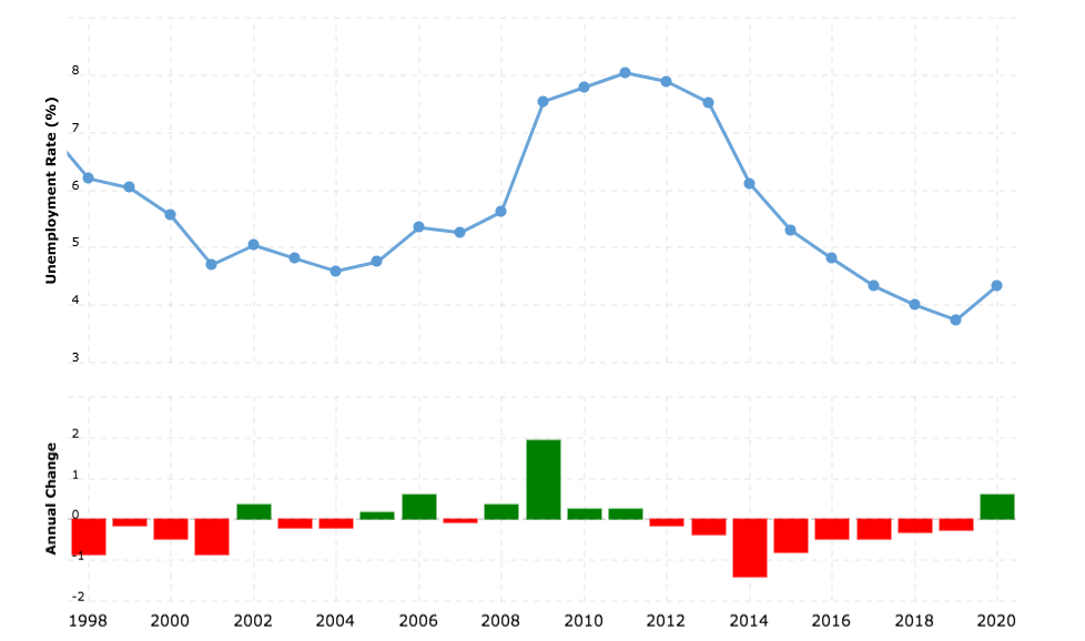
A diagram showing the unemployment rate in the UK from 1998 - 2020
Source: Macrotrends
- Unemployment tends to be inversely proportional to real GDP growth
- When real GDP increases, unemployment falls
- When real GDP decreases, unemployment rises
- Unemployment in the UK remained relatively high for the six years following the global financial crisis of 2007
Low & Stable Rate of Inflation
- The UK has a target inflation rate of 2% using the Consumer Price Index (CPI)
- A low rate of inflation is desirable as it is a symptom of economic growth
- The different causes of inflation (cost push or demand pull) require different policy responses from the Government
- Demand-side policies ease demand pull inflation
- Supply-side policies ease cost push inflation
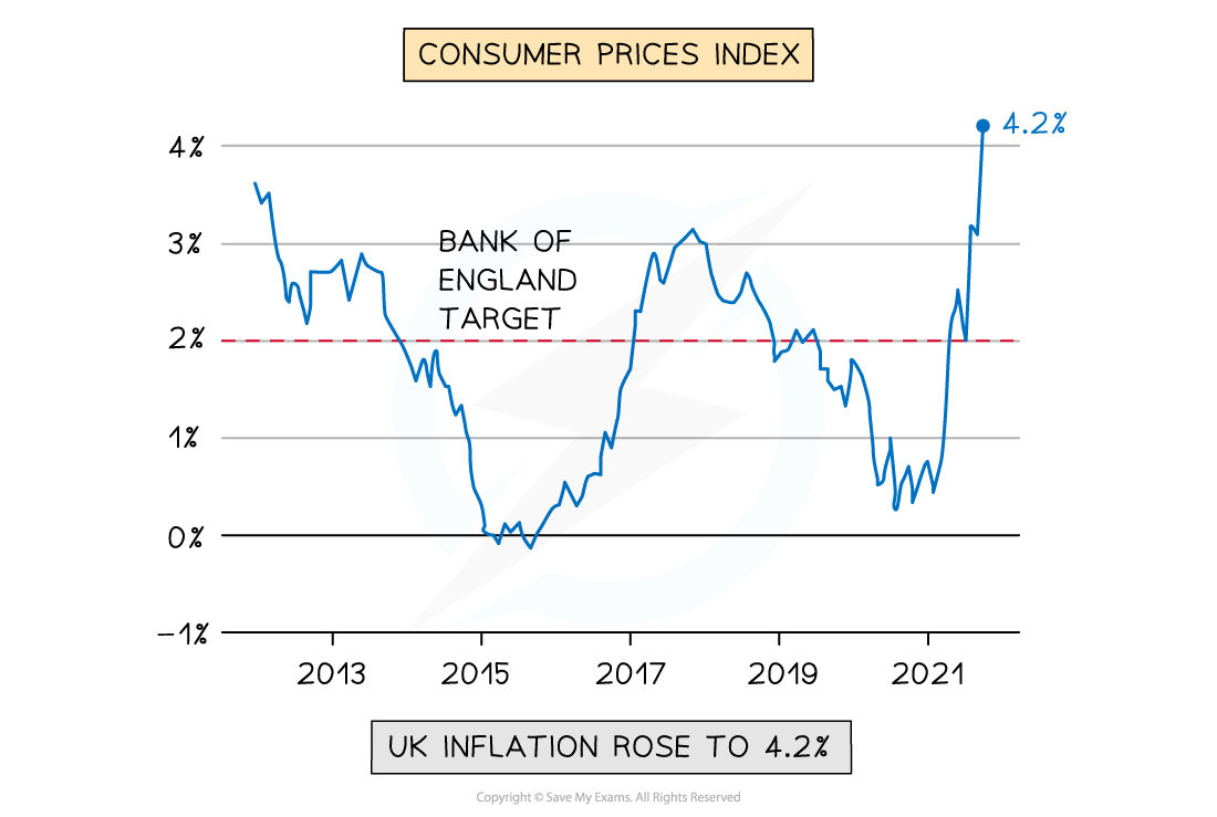
A diagram illustrating the inflation rate in the UK from 2012 to 2021 using the CPI
- In the UK, a continual deviation from the target of 2% would not be considered as stable
- An inflation rate in April 2022 of 4-5% was considered to be unstable, eroding household purchasing power
- A low & stable rate of inflation is important as it
- Allows firms to confidently plan for future investment
- Offers price stability to consumers
Balance of Payments Equilibrium On The Current Account
- The Balance of Payments (BoP) for a country is a record of all the financial transactions that occur between it and the rest of the world
- The current account focuses mainly on the financial transactions related to exports and imports of goods/services
- Governments aim for Balance of Payments equilibrium on the Current Account
- If exports > imports it will create a current account surplus
- If imports > exports, it will create a current account deficit
- Each one of these conditions has advantages/disadvantages associated with it
- However, a current account deficit is more problematic in the long-run
- The UK has traditionally run a small deficit
- As a % of GDP the UK current account deficit is insignificant so has not been problematic
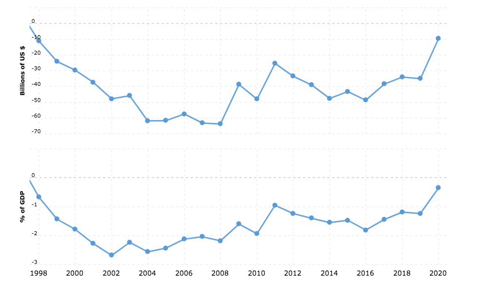
A diagram showing the UK Trade Deficit from 1998 to 2020. The bottom graph illustrates the trade deficit as a % of GDP and the top one illustrates the absolute value expressed in US$
Source: Macrotrends
- In the diagram above the trade deficit has been falling steadily since 2016
- During this time period the value of exports was increasing slightly faster than the value of imports
Balanced Government Budget
- The Government Budget is presented annually and includes the forecasted revenue and expenditure
- Revenue comes from the sale of assets, taxes, sales revenue from goods/services e.g. train tickets
- Expenditure includes all government spending such as public sector salaries; unemployment benefits; spending on public & merit goods
- The UK Government aims to run a balanced budget
- If expenditure > revenue, there is a budget deficit
- Any deficit has to be financed through public sector borrowing
- Any borrowing is added to the public sector debt (Government debt)
- If the UK Government debt becomes too high (expressed as a % of GDP), then lenders begin to lose confidence in the Government's ability to repay the debt
- The Government then has to raise the interest rate it offers to lenders, which makes borrowing more expensive
- The UK Government has worked extremely hard recently to reduce the budget deficit and run a balanced budget
- Covid 19 expenditure has eroded the progress they made
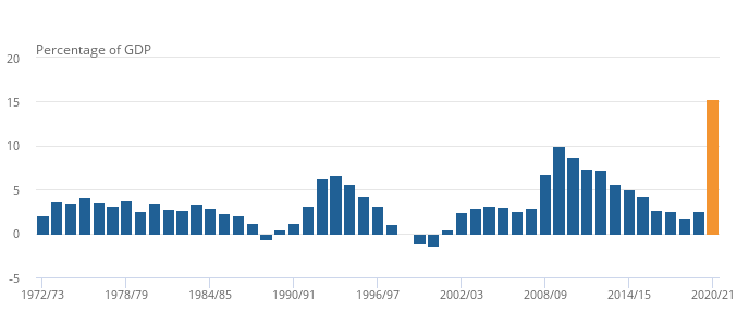
Government deficit (net borrowing) as a percentage of GDP - 1973 to 2021
Source: ONS
- Reducing the deficit can mean tough choices for the economy
- E.g. cutting public sector pay; raising taxes; reducing unemployment benefits; reducing spending on merit goods
- The significant deficit increase in the 2020/21 budget due to Covid 19 will need to be repaid
- The short-term help offered through the crisis may generate long-term pain as the Government seeks to cut future spending so as to repay the debt
Environmental Protection
- In April 2021, the UK Government stated that their environmental aim was to reduce emissions by 78% by 2035
- This reduction is based on the emission levels of 1990
- It is one of the most ambitious climate change targets globally
- It includes the UK’s share of international aviation and shipping emissions
- Broader environmental aims include
- A focus on sustainability
- The reduction of negative externalities of production
- 100% energy from renewable sources by 2035
Greater Income Equality
- The reduction of income inequality remains a high priority
- High levels of income inequality create social unrest and can ultimately lead to revolutions
- Income inequality is measured using the Gini Coefficient
- Most developed economies have a Gini target of 0.3-0.4
- Perfect income equality is not desirable as it removes the incentive to work and study
- Unchecked capitalism has a natural outcome of high income inequality
- The wealthy are able to keep buying factors of production
- The concentration of ownership becomes more and more narrow with fewer individuals owning the bulk of the world's wealth
- There is a need for the UK government to intervene to maintain acceptable levels of income inequality
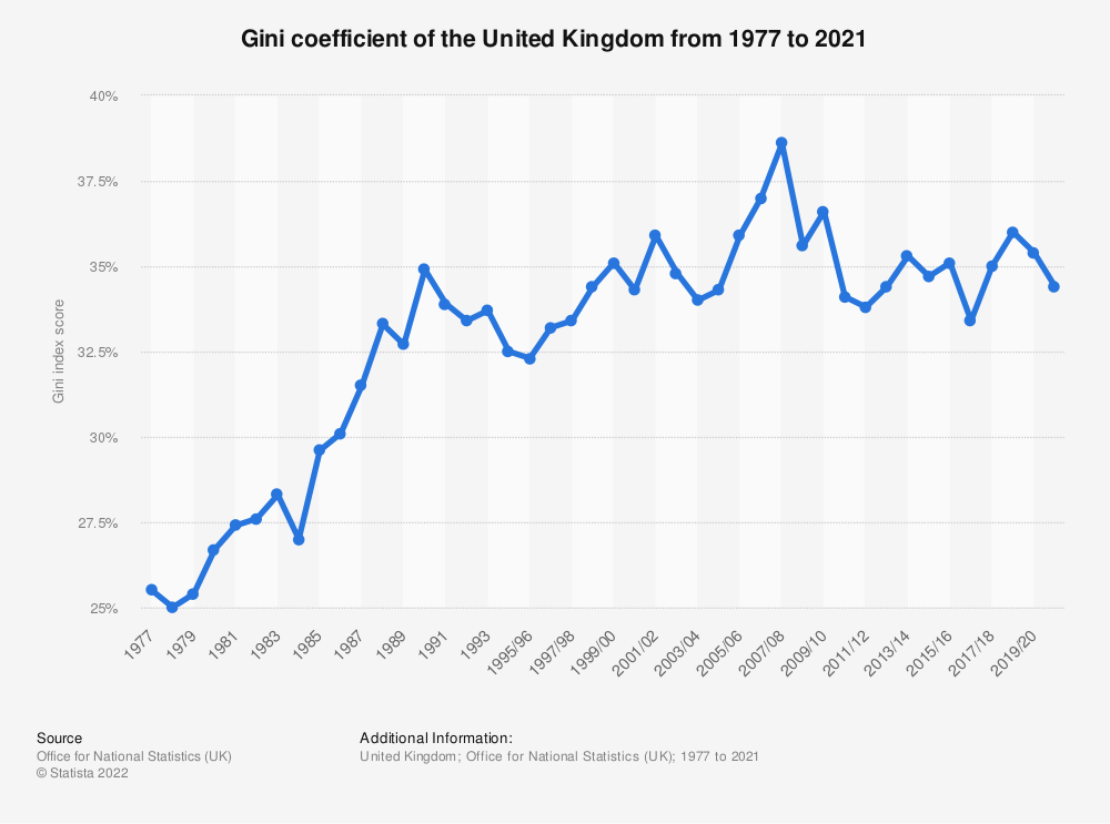
A diagram showing the general increase in income inequality in the Uk since 1977
Source: ONS
- In the diagram above, the Gini coefficient has been multiplied by 100 to create percentage
- 34% would equate to a coefficient of 0.34
- Absolute poverty is worse in developing countries. However, In a developed economy such as the UK, a 1% increase in income inequality can push a lot more households into absolute poverty
转载自savemyexams
以上就是关于【Edexcel A Level Economics A:复习笔记2.6.1 Possible Macroeconomic Objectives】的解答,如需了解学校/赛事/课程动态,可至翰林教育官网获取更多信息。
往期文章阅读推荐:
翰林独家 | 经济学竞赛核心精讲,一册打通NEC/IEO/USAEBO!
2026 ALEVEL 夏考A率出炉!爱德思vs牛津AQA,哪些科目真的“好出分”?


翰林AMC8视频课重磅上线!

国际竞赛真题资源免费领取