AQA A Level Maths: Statistics复习笔记2.4.1 Correlation & Regression

Scatter Diagrams
What does bivariate data mean?
- A lot of statistics is about looking at how different factors, or variables change how data behaves
- Bivariate data is data which is collected on two variables and looks at how one of the factors affects the other
- Each data value from one variable will be paired with a data value from the other variable
- The two variables are often related, but do not have to be
What is a scatter diagram?
- A scatter diagram is a way of graphing bivariate data
- You may be asked to plot, or add to, a scatter diagram
 Scatter diagrams allow statisticians to look for relationships between the two variables
- Some scatter diagrams will show a clear relationship know as correlation (see below)
- Others will not display on obvious relationship
- If a scatter diagram shows a relationship you may be asked to identify outliers
Worked Example
The scatter diagram below shows the number of Save My Exams question packs completed by a group of students and the percentage score they received in their A-Level Statistics exam.
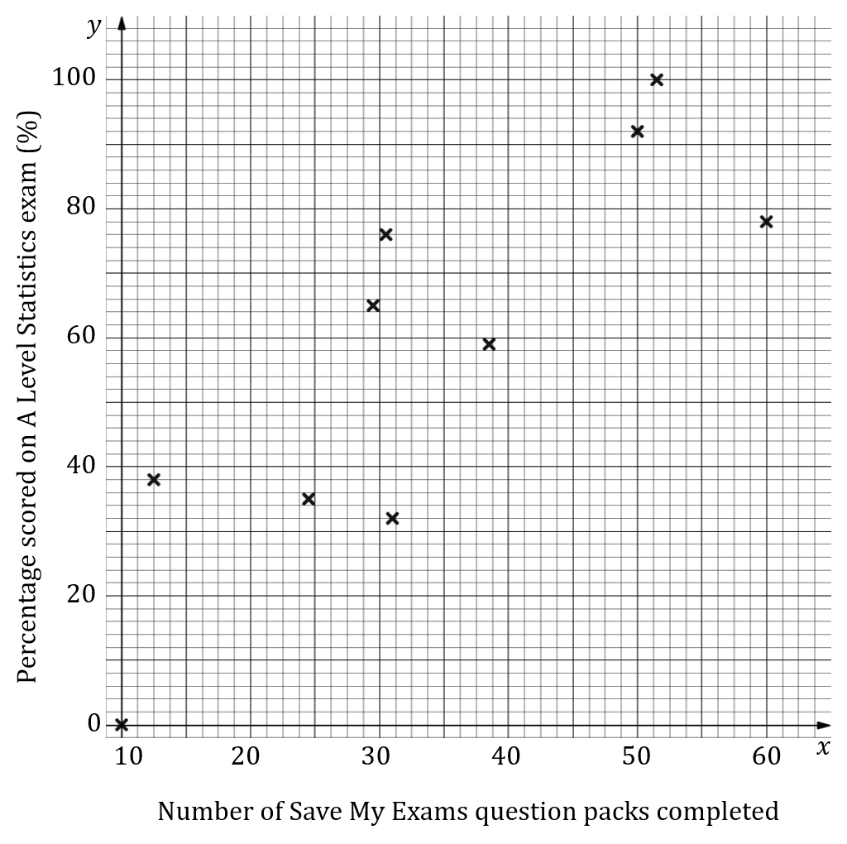
(i)State which of the variables is the explanatory variable and which is the response variable.
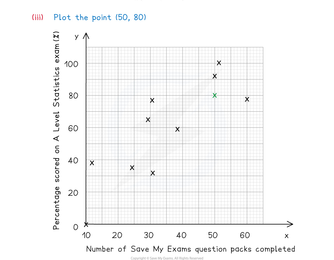
 (iii)Another student completed 50 question packs and scored 80% on their A Level Statistics exam, add this data to the scatter diagram.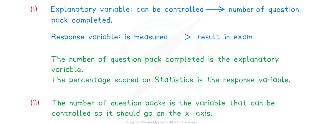
Exam Tip
- Learn the vocabulary for the types of variables as you could be asked a question on this. Make sure you check the scales carefully when plotting any points.
Correlation
What is correlation?
- Correlation is how the relationship between the two variables is described
- Perfect linear correlation means that the bivariate data will all lie on a straight line on a scatter diagram
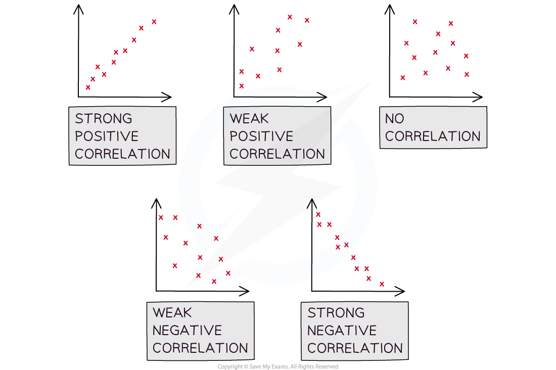
- Linear correlation can be positive or negative and it can be strong or weak
- Positive correlation describes a data set where both variables are increasing
- Negative correlation describes a data set where one variable is increasing and the other is decreasing
- When describing correlation you should say whether it is positive or negative and also say whether it is strong or weak
- If correlation exists then there could be outliers, these will be data points that do not fit the pattern seen on the graph
- There will likely be a maximum of one or two outliers on any scatter diagram
- You may be asked to identify the outliers
What is the difference between correlation and causation?
- It is important to be aware that just because correlation exists, it does not mean that the change in one of the variables is causing the change in the other variable
- Correlation does not imply causation!
- If a change in one variable causes a change in the other then the two variables are said to have a causal relationship
- Observing correlation between two variables does not always mean that there is a causal relationship
- Look at the two variables in question and consider the context of the question to decide if there could be a causal relationship
- If the two variables are temperature and number of ice creams sold at a park then it is likely to be a causal relationship
- Correlation may exist between global temperatures and the number of monkeys kept as pets in the UK but they are unlikely to have a causal relationship
- Observing a relationship between two variables can allow you to create a hypothesis about those two variables
Worked Example
The scatter diagram below shows the number of Save My Exams question packs completed by a group of students and the percentage score they received in their A-Level Statistics exam.
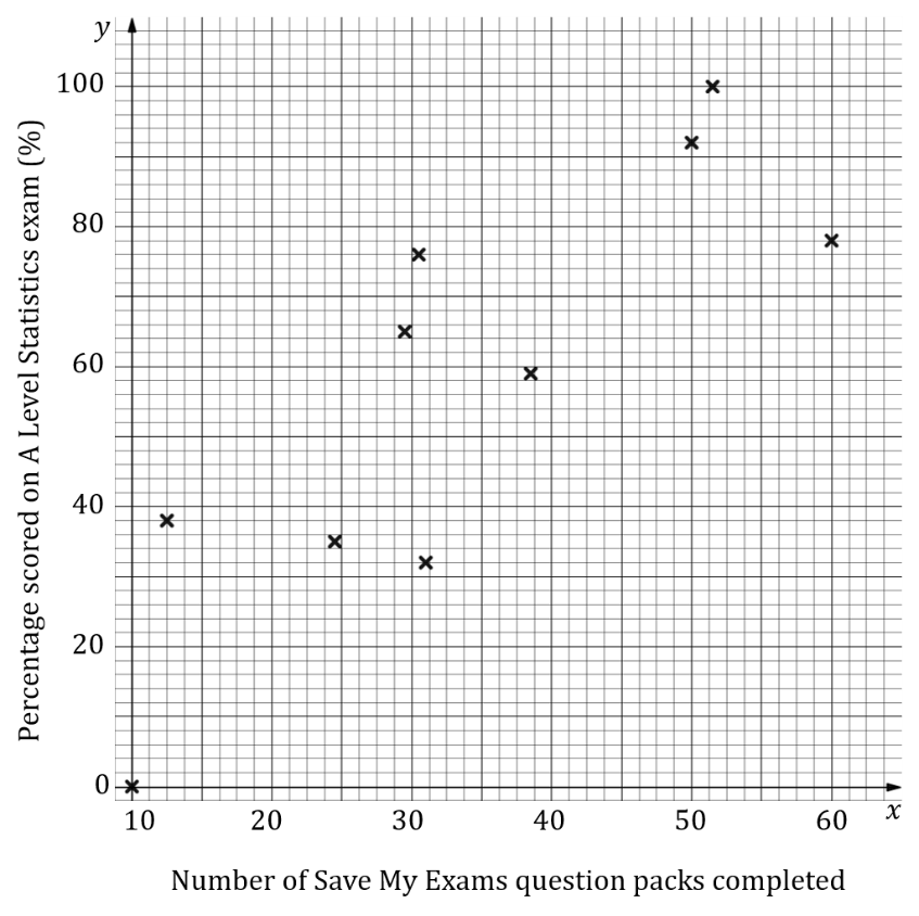
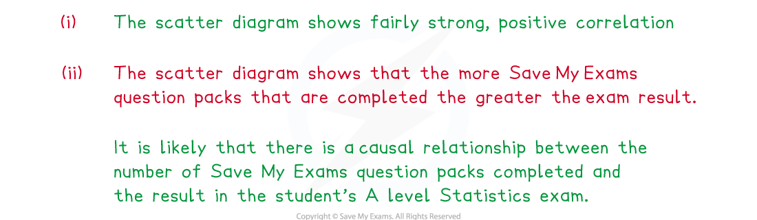
(i)Describe the correlation shown in the scatter diagram.
(ii)Decide if you think there could be a causal relationship between the two variables and explain your reasoning.
Linear Regression
What is linear regression?
- If strong linear correlation exists on a scatter diagram, then a line of best fit can be drawn
- This is a linear graph added to the scatter diagram that best approximates the relationship between the two variables
- At GCSE this will have been drawn by eye as a line that fits closest to the data values
- The data can be used to calculate the equation of the straight line that represents the best fit of the relationship between the two variables
- You do not need to know how to calculate it but you will need to be able to interpret one
- The least squares regression line is the line of best fit that minimises the sum of the squares of the gap between the line and each data value
- This is usually called the regression line and can be calculated either be looking at the vertical or the horizontal distances between the line and the data values
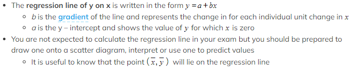
- If the regression line is calculated by looking at the vertical distances it is called the regression line of y on x
- If the regression line is calculated by looking at the horizontal distances it is called the regression line of x on y
- The regression line of x on y is rarely used and you are unlikely to come across it at this level
 How to use a regression line?
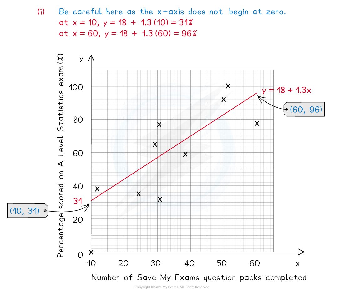
- Drawing a regression line is done in the same way as drawing a straight line graph, substitute some values from the independent data set to help you
- The regression line can be used to decide what type of correlation there is if there is no scatter diagram
- If b is positive then the data set has positive correlation and if b is negative then the data set has negative correlation
- The value of b can be used to interpret how the data is changing
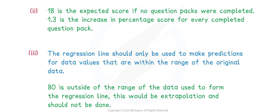
 The regression line can also be used to predict the value of a dependent variable from an independent variable
- Predictions should only be made for values of the dependent variable that are within the range of the given data
- Making a prediction within the range of the given data is called interpolation
- Making a prediction outside of the range of the given data is called extrapolation and is much less reliable
- The prediction will be more reliable if the number of data values in the original sample set is bigger
Worked Example

Exam Tip
- Remember that the value of b is the gradient of the regression line, a greater value of b does not mean stronger correlation. When using a regression line to make a prediction make sure that the value you are predicting from falls within the range of the data used to calculate the regression line.
转载自savemyexams
以上就是关于【AQA A Level Maths: Statistics复习笔记2.4.1 Correlation & Regression】的解答,如需了解学校/赛事/课程动态,可至翰林教育官网获取更多信息。
往期文章阅读推荐:
翰林独家 | 经济学竞赛核心精讲,一册打通NEC/IEO/USAEBO!
2026 ALEVEL 夏考A率出炉!爱德思vs牛津AQA,哪些科目真的“好出分”?


翰林AMC8视频课重磅上线!

国际竞赛真题资源免费领取